
Overview
Overseas Adventure Travel (O.A.T.) is a leading travel company with roots in print material. They aim to pivot and be more web-focused in 2025 and beyond. I helped the company set its framework and expand into the digital world with a new design system.
$120K Projected Savings
Developer Time Savings
Designer Time Savings
Launched New CMS on time
Timeline
Q4 2024–Q2 2025
Role
UI Designer
Issue
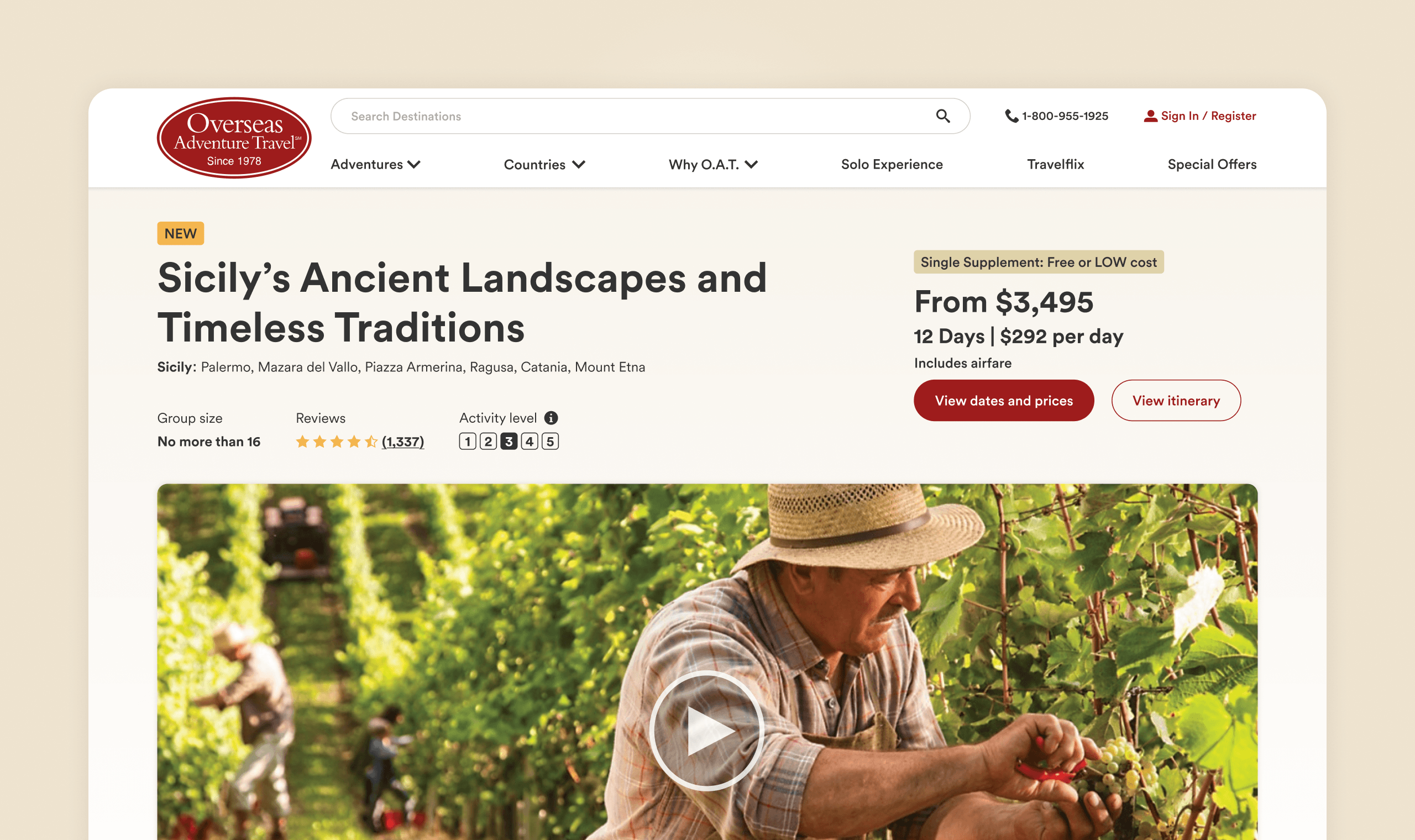
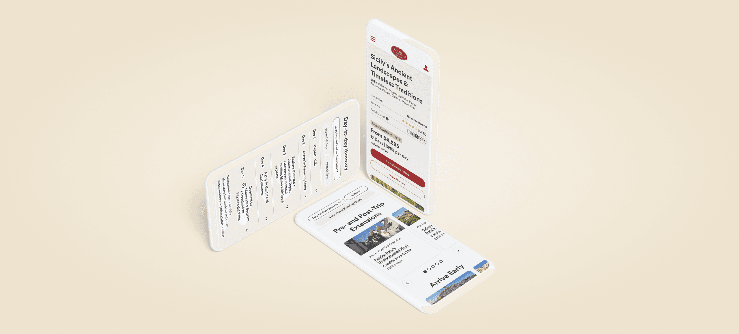
O.A.T. didn't have a design system when I joined. Pages were inconsistent not only between page to page, but also within the pages themselves with varying buttons, font sizes, typefaces, etc. With the new focus on web and a new CMS system, we needed a cohesive and engaging design system to set the foundation for the brand and its new CMS.
Solution
I created a design system to use across all of web. This includes typography, colors, buttons, icons, components, documentation, and so on and so forth. I worked with our front-end and back-end teams to ensure the design system was visually cohesive and practical to implement. Accessibility was also a key focus and we made sure to follow WCAG guidelines. The system follows atomic design methodology to help streamline processes and ensure consistency.
Did it work?
Yes! Designers and developers both benefit from this new system. We saw less time spent on designing and coding new projects, improved QA, and consistency across pages new and old. Our biggest win was launching our site in our new CMS on time.
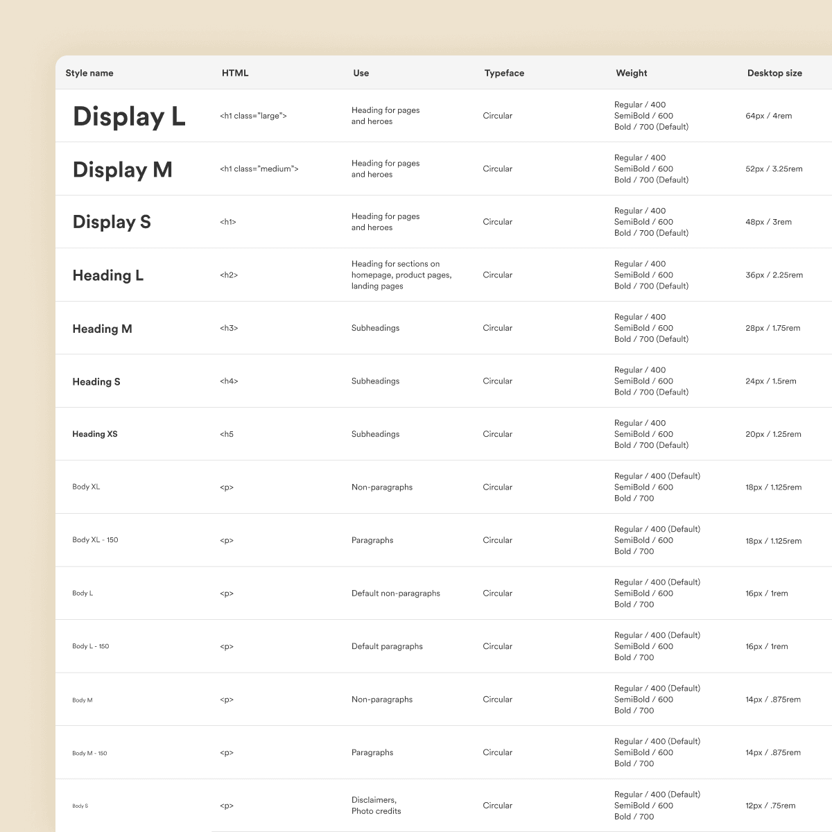
Typography
Switched from Open Sans to Circular, upgrading from a common free typeface to a more distinctive paid one.
Flexible system that supports all screen sizes. Defined specific use cases, font sizes, font weights, responsive sizes, and line heights for consistent styling.
Colors
The design system features a full suite of colors with tints and shades, ensuring accessibility, hierarchy, brand recognition, and visual appeal.
Beyond aesthetics, our color system is created with accessibility in mind, adhering to WCAG contrast standards to support readability for all users.

Buttons and chips
Assortment of buttons and chips to help users navigate and use our site. Interaction states and different variations to help with accessibility and hierarchy

Components
Reusable components to speed up the design and developing process and ensure consistency.